
Discover the importance of color in design and learn how to use it effectively.
This comprehensive guide covers the fundamentals of color theory and provides practical tips for incorporating color into your design projects.
Colors are a powerful tool in design, capable of evoking emotions, conveying messages, and creating visual impact. Understanding the fundamentals of color theory is essential for designers looking to create aesthetically pleasing and effective visuals. In this comprehensive guide, we’ll explore the key principles of color in design and provide practical tips for using colors effectively in various design projects.
Importance of Color in Design
Color is not just a visual element; it carries meaning and communicates emotions. Different colors evoke different feelings and have psychological associations. For example, warm colors like red and orange are often associated with energy and passion, while cool colors like blue and green evoke calmness and tranquility. By understanding the psychological effects of colors, designers can strategically use them to elicit specific emotions and create the desired impact in their designs.
Understanding Color Theory
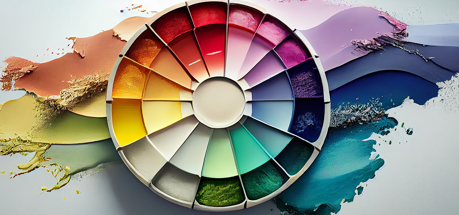
To effectively work with colors, designers need to understand the basics of color theory. This includes concepts such as the color wheel, color harmony, and color relationships. The color wheel provides a visual representation of how colors are organized and can be used to create harmonious color schemes. Understanding concepts like complementary colors, analogous colors, and color temperature allows designers to create visually balanced and appealing designs.
Color Theory Basics: The Color Wheel in a Nutshell
Applying Color in Design
Once you have a grasp of color theory, it’s important to consider how to apply color effectively in your design projects. This includes considerations such as color contrast, color psychology, and color symbolism. Understanding color contrast ensures that your design elements are distinguishable and readable. Color psychology helps you choose colors that align with the message and emotions you want to convey. Additionally, color symbolism can vary across cultures and contexts, so it’s important to be mindful of cultural associations when choosing colors.
Adobe has a great online tool that will help you pick all sorts of color combinations – https://color.adobe.com/create/color-wheel
Practical Tips for Using Colors in Design
To help you use colors effectively in your designs, we’ve compiled some practical tips:
- Start with a mood board: Collect color palettes, inspiration, and references to guide your color choices.
- Consider your target audience: Different colors can have varying cultural and demographic associations, so understanding your audience is crucial.
- Use color to create hierarchy: Colors can help establish visual hierarchy and guide the viewer’s attention to important elements.
- Test color combinations: Experiment with different color combinations to find the ones that work best for your design objectives.
- Stay consistent: Maintain a consistent color palette throughout your design to create a cohesive and harmonious visual experience.
Remember, colors have the ability to evoke emotions, tell stories, and make a lasting impact. By mastering the fundamentals of color in design, you can elevate your design projects and create memorable experiences for your audience.